A guest post by Ovi
Each month the EIA produces four reports which project oil output for the US and the World. The Short Term Energy Outlook (STEO) forecasts oil output for a period of 12 to 24 months into the future for US and World oil production. A second report, the Drilling Productivity Report (DPR) forecasts the combined production for conventional and tight oil in the main tight oil basins, four months ahead of the EIA monthly report. Their third report, Light Tight Oil (LTO), reports on only the tight oil produced in seven tight oil basins and a few smaller ones. A fourth and final outlook is the Monthly Energy Review (MER) that forecasts US output two months past the official US production numbers, for this report that will be October and November. Due to technical issues at the EIA, the LTO report and the MER were not available at press time.
Production numbers/charts for May for four countries obtained from their official sites are provided below.
Normally the Outlooks report appears at the end of the monthly US report. For this month it has been posted separately and early.
1) Short Term Energy Outlook
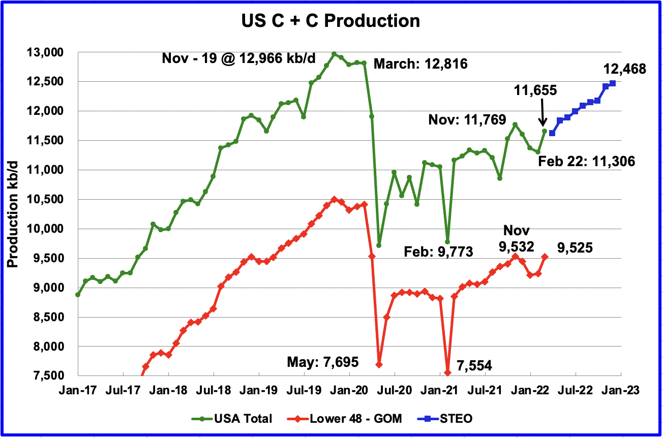
The June STEO provides projections for the next 21 months, starting with April 2022 to December 2023, for US C + C and other countries.
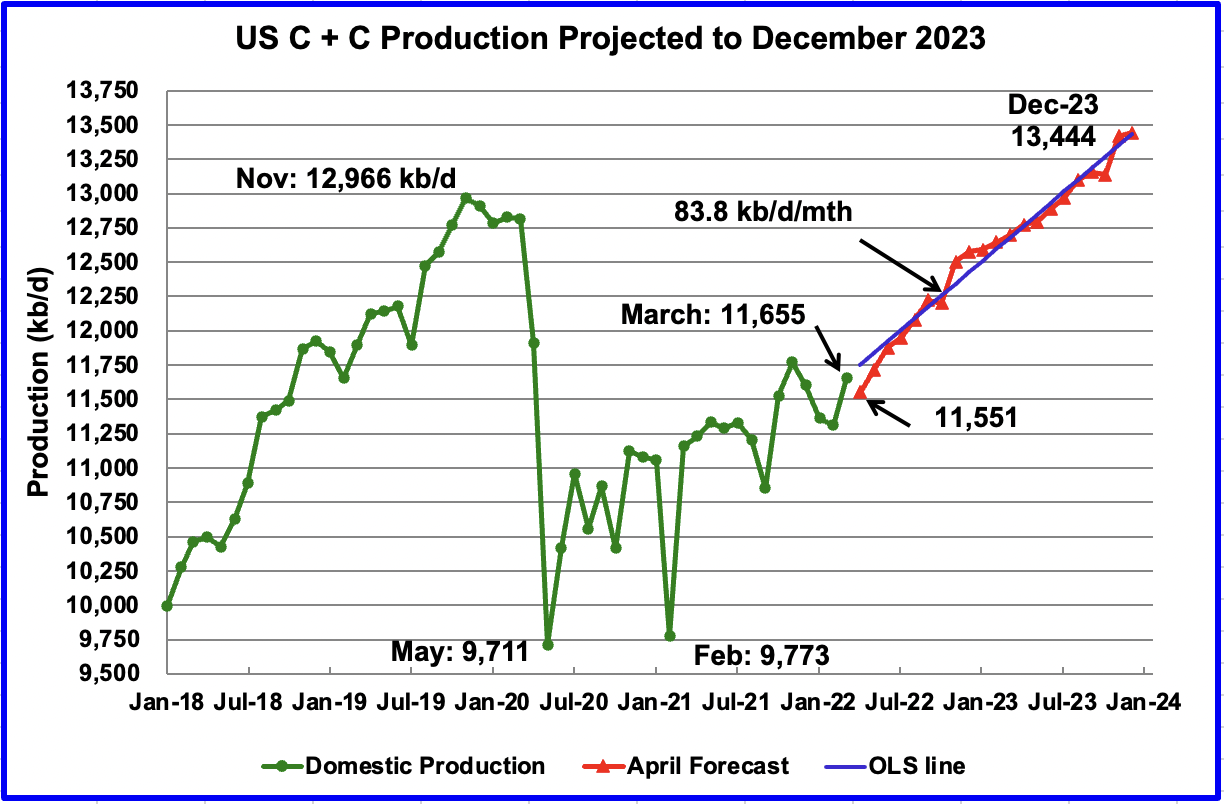
The June 2022 STEO has revised downward its projected US oil output from May 2022 to Q3-23. However Q4-23 has been revised up from the previous May 2022 STEO. In December 2023 output is expected to reach 13,444 kb/d, 160 kb/d higher than reported in the May report
Read More