A post by Ovi at peakoilbarrel.
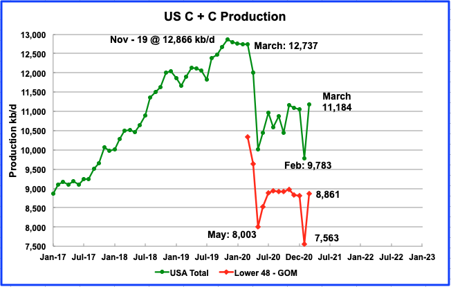
All of the oil (C + C) production data for the US state charts comes from the EIAʼs Petroleum Supply monthly PSM. The charts below are updated to March 2021 for the 10 largest US oil producing states.

Comments not related to oil or natural gas production in this thread please, Thanks.
Read MoreThere’s not much revelatory here, more a completist’s list showing reserve changes for seven IOCs, with more to come over the next months, but it gives me an excuse for a rant at the end.
There are a few general trends but exceptions to each one. As discoveries have dropped production has been maintained, presumably through in-fill drilling and other brownfield activities – this can’t be construed from the data shown, although deeper analysis of the annual reports such as looking at drilling activities and financial details might be able to give further insight. Therefore remaining reserves have fallen as have reserve to production (R/P) ratios. Replacement ratios have been at or just below 100% and seem to be dropping faster – i.e. depletion is accelerating and actually seems to be particularly pronounced in recent years (acceleration of acceleration is called jerk or jounce I think). Looking at individual companies doesn’t give the full picture because of purchases and sales, but there is less of that than I expected for the companies shown here. A fuller picture might come when combining all the larger companies but even then it will not be complete. The recovery ratios are show for the organic numbers (i.e. without the net trades) as solid lines and trend lines with overall ratios shown as marker points.
Read MoreComments not related to oil or natural gas production in this thread please, Thanks.
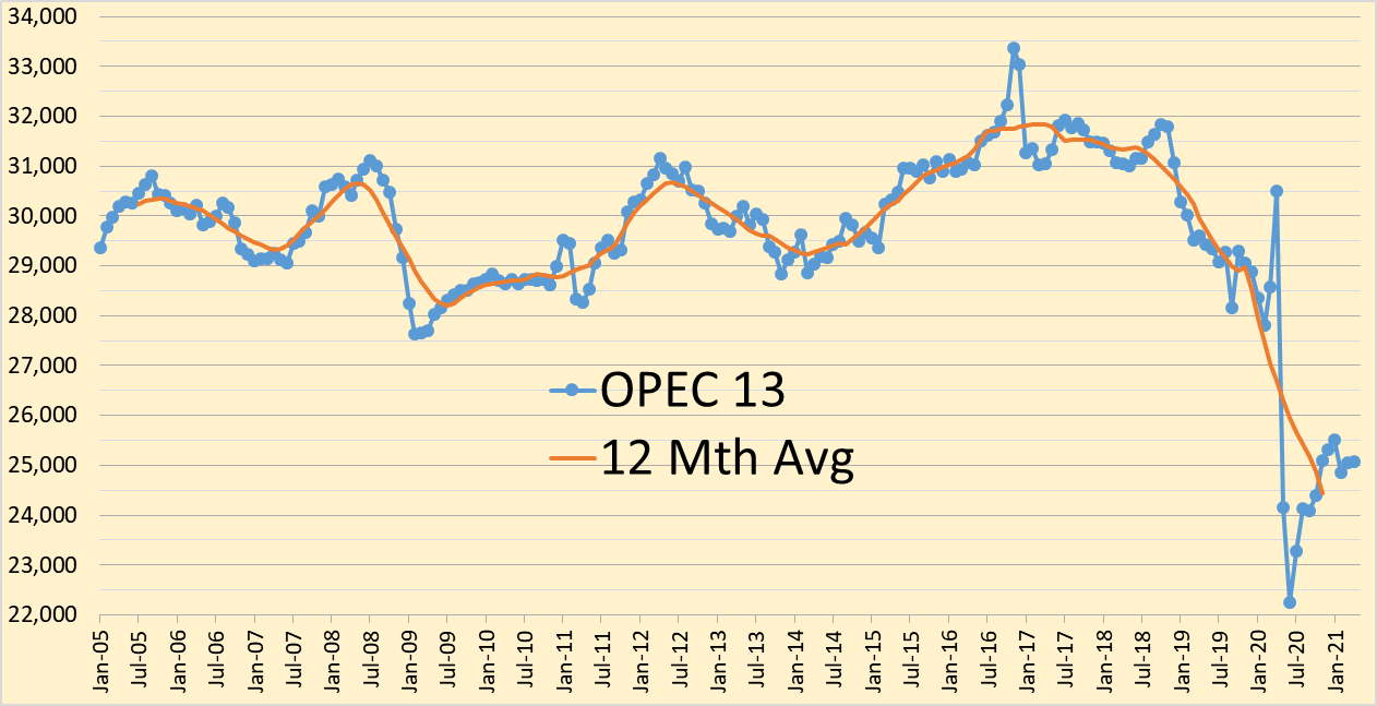
The OPEC Monthly Oil Market Report for May 2021 was published this past week. The last month reported in each of the charts that follow is April 2021 and output reported for OPEC nations is crude oil output in thousands of barrels per day (kb/d). In most of the charts that follow there is a red (and in one case yellow) line without markers which is the centered twelve month average (CTMA) for output. Note that this a change from the way Ron Patterson has reported the average data for many years which used a trailing twelve month average. Essentially the curve shifts back in time by 5 months as I choose July as the center month for the January to December 12 month average.
