North Dakota and the Bakken by County

Looking at North Dakota oil production by county, and historical production by county, gives a better  perspective of what is happening in the Bakken and the rest of North Dakota than just looking at total production.

The data is available here: ND Historical Barrels of Oil Produced by County You will notice it says:(Confidential Wells are Not Included). However the total North Dakota does include confidential wells. And I have made adjustments for the confidential wells. The adjustment for March and April came from the NDIC here: State Summary Report April 2014.
Bakken Counties

The above chart is after adjustment for confidential wells. Even the lowest producer of the big four, Dunn County, outproduces the rest of North Dakota combined.

McKenzie

McKenzie was up 7,168 barrels per day after adjustment this month.
Read More

Oil Field Models, Decline Rates and Convolution

This post is by Dennis Coyne

The eventual peak and decline of light tight oil (LTO) output in the Bakken/ Three Forks play of North Dakota and Montana and the Eagle Ford play of Texas are topics of much conversation at the Peak Oil Barrel and elsewhere.

The decline rates of individual wells are very steep, especially early in the life of the well (as much as 75% in the first year for the average Eagle Ford well), though the decline rates become lower over time and eventually stabilize at around 6 to 7% per year in the Bakken.

What is not obvious is that for the entire field (or play), the decline rates are not as steep as the decline rate for individual wells. I will present a couple of simple model to illustrate this concept.

Much of the presentation is a review of ideas that I have learned from Rune Likvern and Paul Pukite (aka Webhubbletelescope), though any errors in the analysis are mine.

A key idea underlying the analysis is that of convolution. I will attempt an explanation of the concept which many people find difficult.

At Wikipedia there is a fairly mathematical presentation of the concepts which often confuses people.  There are a couple of nice visuals to convey the concept as well see this page.

In the visual below a function f (in blue) is convolved with a function g (in red) to produce a third function (in black) which we could call h where h=f*g and the asterisk represents convolution, just as a + symbol is used to represent addition.

Convolution of box signal with itself2.gif
Convolution of box signal with itself2” by Convolution_of_box_signal_with_itself.gif: Brian Amberg
derivative work: Tinos (talk) – Convolution_of_box_signal_with_itself.gif. Licensed under CC BY-SA 3.0 via Wikimedia Commons.

I think the best way to present convolution is with pictures. Chart A below shows a relationship between oil output (in barrels per month) and months from the first oil output for the average well in an unspecified LTO play.

This relationship is a simple hyperbola of the form q=a/(1+kt), where a and k are constants of 13,000 and 0.25 respectively, t is time in months, and q is oil output.

Chart A is often referred to as a well profile. The values for the constants were chosen to make the well profile fairly similar to an Eagle Ford average well profile. EUR30 is the estimated ultimate recovery from this average well over a 30 year well life.

blog140617/
Read More

World Energy 2014-2050 (Part 1)

This is a guest post by Political Economist

World Energy 2014-2050: An Informal Annual Report

 “Political Economist” June 2014

The purpose of this informal report is to provide an analytical framework to track the development of world energy supply and demand as well as their impacts on the global economy. The report projects world supply of oil, natural gas, coal, nuclear, hydro, wind, solar, biofuels, and other renewable energies from 2014 to 2050.  It also projects the overall world energy consumption, gross world economic product, energy efficiency, and carbon dioxide emissions from 2014 to 2050.

The basic analytical tool is Hubbert Linearization, first proposed by American geologist M. King Hubbert.  Despite its limitations, Hubbert Linearization provides a useful tool helping to indicate the likely level of ultimately recoverable resources under the existing trends of technology, economics, and geopolitics.  Other statistical methods and some official projections will also be used where they are relevant.

Oil

According to BP Statistical Review of World Energy 2014, world oil consumption (including crude oil, natural gas liquids, coal-to-liquids, gas-to-liquids, and biofuels) reached 4,185 million metric tons (91.3 million barrels per day) in 2013, 1.4 percent higher than world oil consumption in 2012.  In 2013, oil consumption accounted for 32.9 percent of the world primary energy consumption.

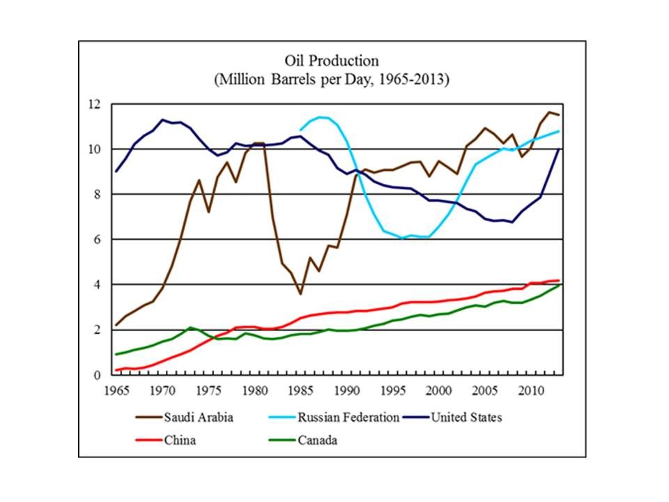
World oil production (including crude oil and natural gas liquids) reached 4,133 million metric tons (86.8 million barrels per day) in 2013, 0.6 percent higher than world oil production in 2012.  Figure 1 shows oil production by the world’s five largest oil producers from 1965 to 2013.

 photo Oil062014-1_zpsc4e13cc7.jpgAs of 2013, world “proved” oil reserves stood at 238 billion metric tons, 1.0 percent higher than the “proved” oil reserves in 2012.

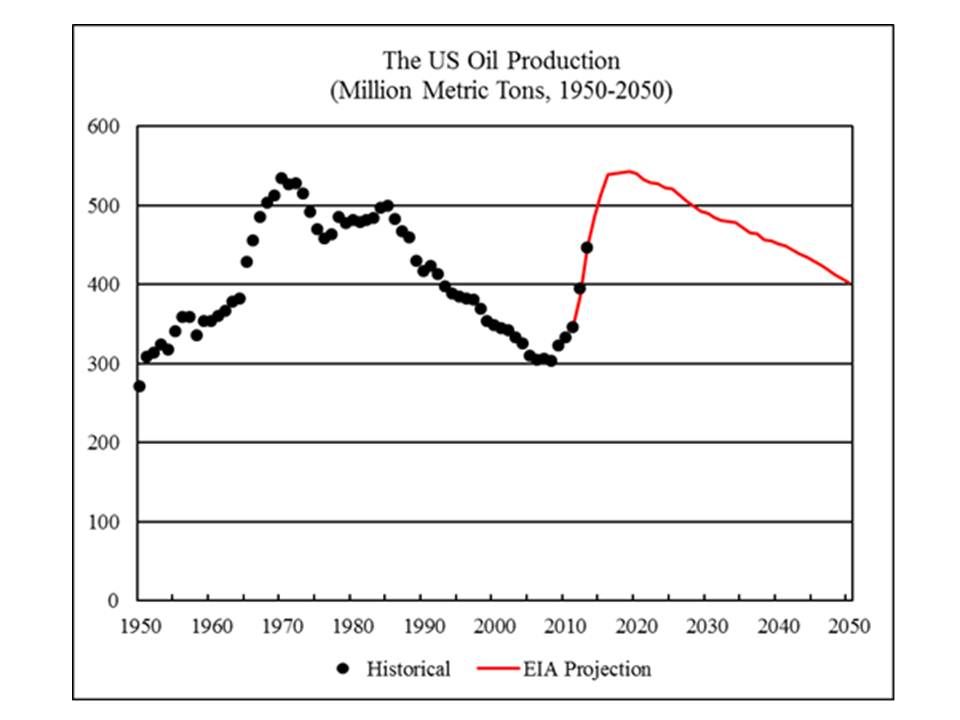
In recent years, the US oil production has surged due to the “shale oil” boom.  The US accounted for all of the growth of world oil production from 2008 to 2013.  Figure 2 shows the historical and projected US oil production from 1950 to 2050.  The projection is based on the reference case scenario for US oil production from 2011 to 2040 projected by the US Energy Information Administration (EIA), extended to 2050 based on the trend from 2031 to 2040.  The EIA reference case projects the US oil production to peak in 2019, with a production level of 543 million metric tons.

 photo Oil062014-2_zps187c496f.jpg
Read More

Texas RRC Report April Production Data

The Texas Rail Road Comission has released their latest report with oil, gas and condensate production for April. The RRC data is always incomplete however and takes many months for the all the data to trickle in. The below chart shows that problem.

Texas RRC-EIA

The data is barrels per data with the EIA data through March and RRC data through April. The EIA has Texas C+C data is highly linear for the 10 months June 2013 through March 2014, increasing at 48 kb/d for 4 months, 41 kb/d for one month then 49 kb/d for the last 5 months.

The EIA has Texas C+C increasing at an average of 48.6 bp/d each month for the last two years. I think that is a little high. I think the production has been increasing at close to 43 kb/d each month but with a recent slow down in that increase.

Texas C+C

All Texas RRC June report data is through April. The RRC does not combine Crude with Condensate so I have to add the two. But here you can see the problem. Each month the reported data increases with the latest months showing the largest increase. However even if this is the case, the latest month should show an increase almost equal to the final total increase for that month. That was the case in the April Report, (January to February), but not the case for the last two reports.
Read More