Africa In Peril

This is a special post by Ron Patterson. Please limit all comments to the subject matter of this post.

Era of ‘Biological Annihilation’ Is Underway, Scientists Warn

From the common barn swallow to the exotic giraffe, thousands of animal species are in precipitous decline, a sign that an irreversible era of mass extinction is underway, new research finds.

The study, published Monday in the Proceedings of the National Academy of Sciences, calls the current decline in animal populations a “global epidemic” and part of the “ongoing sixth mass extinction” caused in large measure by human destruction of animal habitats. The previous five extinctions were caused by natural phenomena.

The wildlife decline in most of the world is terrible, but in Africa it is catastrophic. By 2100 there will be no megafauna whatsoever in Africa. All elephants, giraffes, rhinoceroses, lions, gorillas, chimpanzees, and even zebras and wildebeest will be totally extinct. And the culprit in this huge animal extinction is Africa’s massive overpopulation problem. It is terrible today but is about to get a whole lot worse.
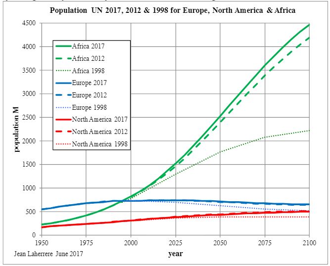
The population of Africa, in 2016, was 1.22 billion. The UN estimates that in 2100 the population of Africa will be about 4.45 billion. Notice that is an increase of about 300 million from their estimate just five years ago. But their 2100 population estimate has doubled since theit 1998 estimate.
Read More

A Surprising Look at Oil Consumption

The EIA publishes oil consumption numbers for all major nations. However they have data for most nations only through 2013. They do have data for some nations through 2014. Nevertheless a lot can be gleaned from just looking at those consumption numbers. If oil consumption numbers are growing year after year, then there is a good chance that nation is growing economically. But if oil consumption numbers are continually declining year after year, then it is more than a little silly to say all is well, economically, with that nation. Or that is my opinion anyway.

First, who’s oil consumption is increasing year after year, or who’s economy is booming? All charts below are consumption as total liquids in thousand barrels per day. Some charts are through 2014 while others are through 2013. Whatever the last year is on the yearly axis is the last year for that data.

Important: All charts are consumption, not production. 

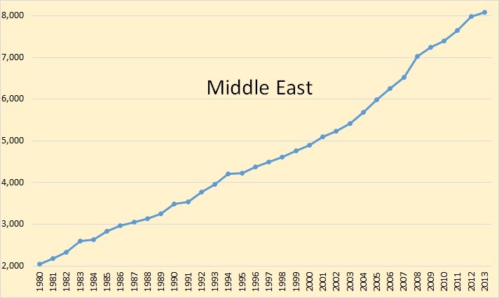
C. Middle East

No doubt the Middle East is booming. The reason, most of them are oil producers and oil, for most of this chart anyway, the price of oil was increasing. They had lots of income, their consumption was increasing every year as was their economies.

Read More

International Rig Count Still Falling

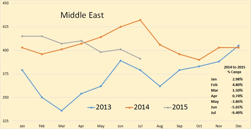
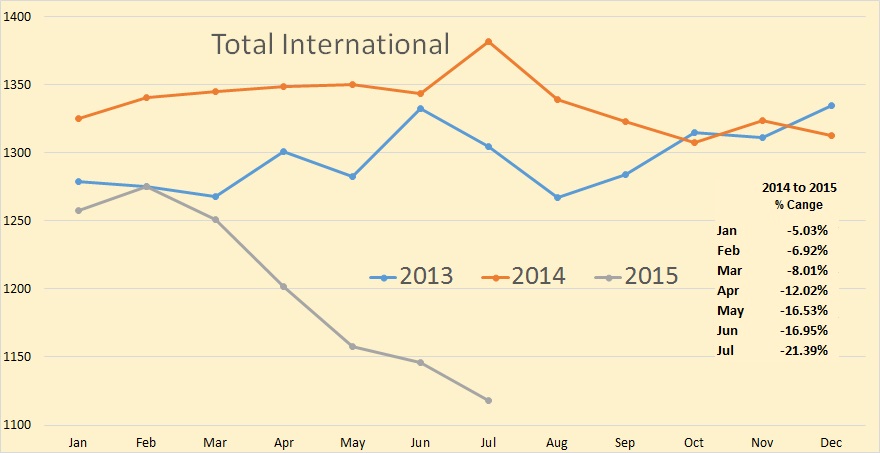
The Baker Hughes International Rig Count is out. I have decided to try something new with the charts. That is to compare the current year’s rig count with the previous two years count and to insert, within the charts, the percent change for this year as compared to last year. Also, this is the total rig count, Oil and Gas. Also the charts are not zero based. I do this in order to better emphasize the monthly change.

July usually sees a big jump in rig counts. This year there was a very tiny July increase, only a fraction of the increase we usually see for July.

Rig Count Total International

*The Total International rig counts does not include the USA, Canada or the FSU. The Total International rig count was down 28 in July to 1118. Last July it was up3 to 1344.


Rig Count Middle East
Read More

World Exports versus Consumption, The ELM

The EIA has updated their International Energy Statistics with annual production numbers through 2014 and export data through 2012. Sometimes these stats can be confusing as they include several types of production and exports. But for production I use only “Crude plus Condensate” and for exports I used “Crude Oil Exports” which I assume includes condensate as well.

Also the export data is not exact, just close, because some importers are also exporters. For instance in 2001 the US exported 59,000 barrels per day. In 2012 the US exported 629,000 barrels per day. The exporting of condensate is allowed in the US and since the Shale boom condensate exports have increased quite dramatically because Light Tight Oil is rather top heavy with condensate.

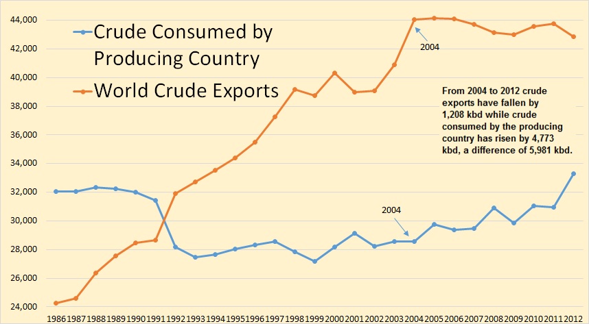
To get exports versus consumption for exporting nations I simply subtracted their exports from their production. The difference was what they consumed. Similar data can be found on the Energy Export Databrowser.

I think the data clearly endorses Jeffrey Brown’s Export Land Model.

World E v C

In 2012 76,160,000 barrels of C+C were produced per day. Of that 76 million barrels 42,845,000 barrels were exported while the other 33,315,000 barrels was consumed by the producing nations. That is this is oil that was never exported.

Read More

International Oil Rig Counts

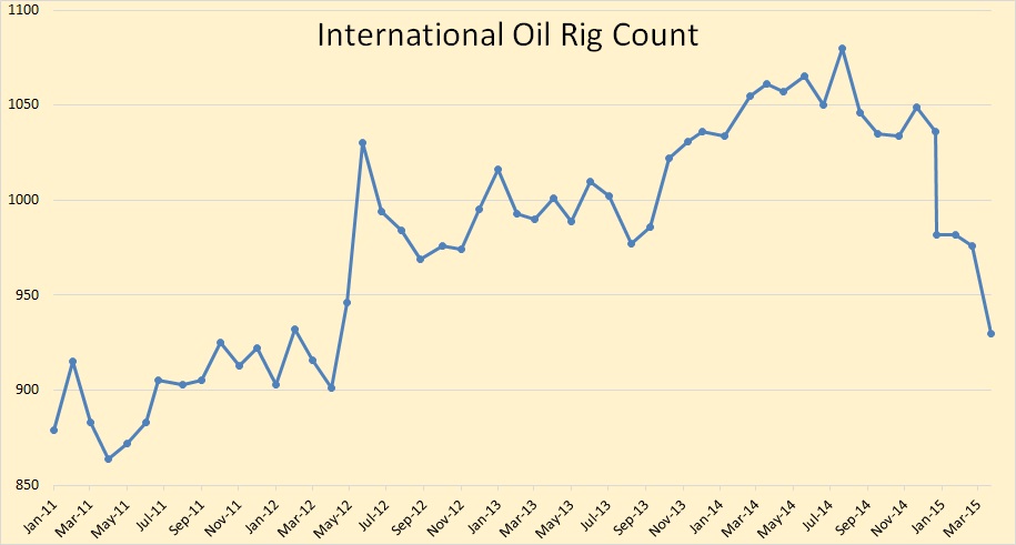
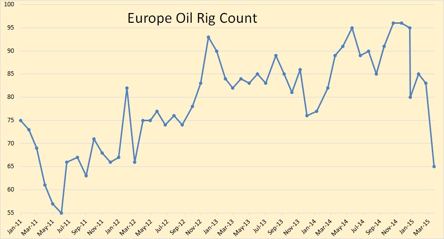
All rig count data is provided by Baker Hughes. All monthly charts are oil rigs only. Gas rigs are not included in the count. The last data point for all monthly charts is April 2015.

When I talk about “peaks” in this post I am only speaking of the peak since 2011 and am not suggesting that there were not higher peaks in previous years.

International Oil Rig Count

The International Rig Count has fallen by 150 rigs, from 1,080 in July 2014 to 930 in April 2015. This count does not include the USA, Canada or any of the FSU countries.

Europe Oil Rig Count

The European Oil Rig Count dropped from 96 in October and November to 65 in April.

Read More