As I reviewed my spreadsheet, I identified a copy and paste error resulting in a mis-calculation of the solar projection. This affects the projection of annual installation of Solar PV capacity (see Part 2).
The correct projections of annual installation of Solar PV capacity are shown below:
Under the current projection, solar PV annual installation is projected to rise from 38 gigawatts in 2013 to 106 gigawatts by 2020. Beyond 2020, the growth will slow down. After 2030, it will plateau and approach 145 gigawatts (not 108 gigawatts as previously stated).
Again, please note this does not imply that solar electricity generation will peak. Instead, it assumes that the GROWTH of solar electricity generation will peak and plateau. In other words, it assumes that at some point in the future, solar electricity generation growth will become linear rather than exponential. (I had an interesting discussion with Dennis on this after the post of Part 2)
I made corrections of the projected primary energy consumption and world GDP in accordance with the solar PV correction. These are shown below.
Total Primary Energy Consumption
According to BP Statistical Review of World Energy 2014, world primary energy consumption reached 12,730 million metric tons of oil-equivalent, 2.3 percent higher than world primary energy consumption in 2012. Figure 24 shows the primary energy consumption by the world’s five largest energy consumers from 1965 to 2013.
EDIT: The EIA updated their International Energy Statistics Monday with their January update. I spent several hours on that update, updating all my spreadsheets, updating the Non-OPEC Charts page, the World Crude Oil Production by Geographical Area page, and creating the post below. Then after I had finished all that they, the EIA, published another International Energy Statistics with the February production data. Sorry but I am exasperated, I will deal with the February update sometime next week. Below is what I prepared before that update. Anyway the emphasis is far more on the yearly numbers than the monthly numbers.
+++++++++++++++++++++++++++++++++++++++++++++++
The EIA finally published an update to their International Energy Statistics. They were over a month late. Last time they were a month late they published two months data. This time no such luck, the data is through January 2014. There was only large revision in the historical data, Canadian December Production was revised up by 298 kb/d. There were several much smaller revisions but World December production was revised up by 273 kb/d to 75,431,000 bp/d in December.
World C+C was up to 76,662,000 barrels per day, an increase of 231 kb/d over December. Average world C+C production was up only 132,000 bp/d in 2013 over 2012.
The Gain was all OPEC however. January OPEC Crude + Condensate production was up by 482,000 bp/d to 32,118,000 bp/d. This is considerably different from what the OPEC Monthly Oil Market Report reported. They had OPEC crude only production up by 147,000 bp/d in January to 29,855,000 bp/d. Understand this is crude only, not C+C. OPEC crude only seems to be holding relatively steady and stood ate 29,765,000 bp/d in May. Read More
According to BP Statistical Review of World Energy 2014, world consumption of nuclear electricity reached 2,489 terawatt-hours (563 million metric tons of oil-equivalent) in 2013, 0.9 percent higher than world consumption of nuclear electricity in 2012. In 2013, nuclear electricity accounted for 4.4 percent of the world primary energy consumption.
Figure 16 shows nuclear electricity consumption by the world’s five largest nuclear electricity consumers from 1965 to 2013.
According to the World Nuclear Association, as of January 2014, 375 gigawatts of nuclear electric power plants were operative worldwide. 75 gigawatts were under construction, 187 gigawatts were being planned, and 351 gigawatts were being proposed. World Nuclear Association claims that most planned nuclear power plants are expected to operate within 8-10 years. Assuming that in 10 years, all of the currently constructed and planned nuclear power plants become operative, then in average the world will need to build 26 gigawatts of nuclear power plants a year in the next 10 years. In reality, some delays are inevitable.
I assume that from 2015 to 2050, the world will build 20 gigawatts of nuclear power plants each year. On the other hand, 2 percent of the existing nuclear generating capacity will retire each year. Under these assumptions, nuclear electricity consumption is projected to rise to 4,648 terawatt-hours (1,052 million metric tons of oil-equivalent) by 2050.
Hydro Electricity
According to BP Statistical Review of World Energy 2014, world consumption of hydroelectricity reached 3,782 terawatt-hours (856 million metric tons of oil-equivalent) in 2013, 2.9 percent higher than world consumption of hydroelectricity in 2012. In 2013, hydroelectricity accounted for 6.7 percent of the world primary energy consumption.
Figure 17 shows hydroelectricity consumption by the world’s five largest consumers of hydroelectricity from 1965 to 2013.
From 2000 to 2013, the average annual growth of world hydroelectricity consumption was about 90 terawatt-hours (20 million metric tons of oil-equivalent). I assume that world hydroelectricity consumption will rise to 880 million metric tons of oil-equivalent in 2014 and will keep growing by 20 million metric tons of oil-equivalent each year from 2015 to 2050. Read More
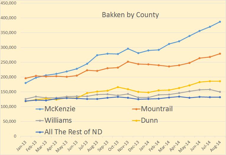
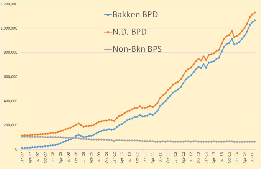
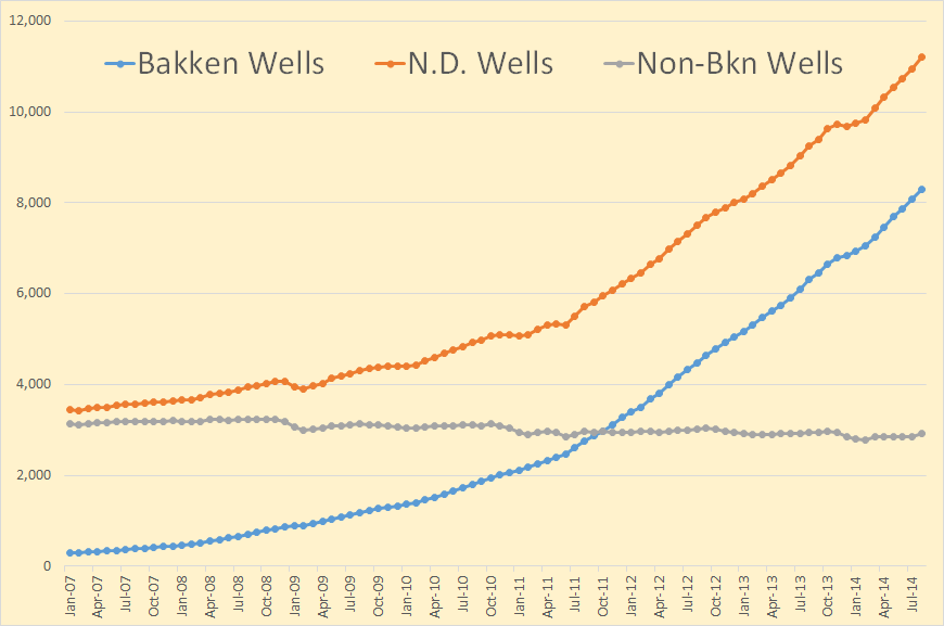
Looking at North Dakota oil production by county, and historical production by county, gives a better perspective of what is happening in the Bakken and the rest of North Dakota than just looking at total production.
The data is available here: ND Historical Barrels of Oil Produced by County You will notice it says:(Confidential Wells are Not Included). However the total North Dakota does include confidential wells. And I have made adjustments for the confidential wells. The adjustment for March and April came from the NDIC here: State Summary Report April 2014.
The above chart is after adjustment for confidential wells. Even the lowest producer of the big four, Dunn County, outproduces the rest of North Dakota combined.
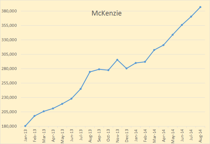
McKenzie was up 7,168 barrels per day after adjustment this month. Read More
The eventual peak and decline of light tight oil (LTO) output in the Bakken/ Three Forks play of North Dakota and Montana and the Eagle Ford play of Texas are topics of much conversation at the Peak Oil Barrel and elsewhere.
The decline rates of individual wells are very steep, especially early in the life of the well (as much as 75% in the first year for the average Eagle Ford well), though the decline rates become lower over time and eventually stabilize at around 6 to 7% per year in the Bakken.
What is not obvious is that for the entire field (or play), the decline rates are not as steep as the decline rate for individual wells. I will present a couple of simple model to illustrate this concept.
Much of the presentation is a review of ideas that I have learned from Rune Likvern and Paul Pukite (aka Webhubbletelescope), though any errors in the analysis are mine.
A key idea underlying the analysis is that of convolution. I will attempt an explanation of the concept which many people find difficult.
At Wikipedia there is a fairly mathematical presentation of the concepts which often confuses people. There are a couple of nice visuals to convey the concept as well see this page.
In the visual below a function f (in blue) is convolved with a function g (in red) to produce a third function (in black) which we could call h where h=f*g and the asterisk represents convolution, just as a + symbol is used to represent addition.
I think the best way to present convolution is with pictures. Chart A below shows a relationship between oil output (in barrels per month) and months from the first oil output for the average well in an unspecified LTO play. This relationship is a simple hyperbola of the form q=a/(1+kt), where a and k are constants of 13,000 and 0.25 respectively, t is time in months, and q is oil output. Chart A is often referred to as a well profile. The values for the constants were chosen to make the well profile fairly similar to an Eagle Ford average well profile. EUR30 is the estimated ultimate recovery from this average well over a 30 year well life.
Chart B shows the relationship between the number of new wells that begin producing each month and the months from the start of production for the entire field.
It is indeed strange that two very different shapes (a hyperbola and a trapezoid) would combine to form the shape shown in chart C. A spreadsheet can be downloaded here, with the scenario above laid out.
What was surprising to me when I first tried this analysis was that a combination of the average well profile with the number of wells added each month reproduced the oil output data fairly closely.
To clarify this further, I have created a simple model. As before, we have a hyperbolic well profile in chart 1 (slightly different than chart A above) and the number of new wells added each month in chart 2, but in chart 2 this is over a short 6 month period. After that time no more new wells are added.
In the chart below I show the output for each group of wells that begins production in successive months. The output from all wells starting production in month 1 are labelled “month 1 wells”, there are 6 of these groups up to “month 6 wells”. The number of wells added each month is shown as a dashed line read off the right axis. Remember that 30 wells are added each month from month 1 to month 6 so output for “month x wells” will be 30 times month 1 of the well profile in month x and 30 times month 2 of the well profile in month x+1, etc.
The convolution of Chart 1 and Chart 2 results in Simple oil model 1 shown below.
This model is very simple in order to present how the principle works in a clear manner. When the annual decline rate for the “field” is compared to the average well’s annual decline rate, they are very similar for this simple 6 month model. More realistic models are presented later for comparison.
Note that month zero in the chart below is the month of maximum annual decline rate, for the average well the maximum annual decline rate happens in month 13 and for the field it occurs in month 18, the curves have been shifted to the left by 13 and 18 months so that the maximum decline rates match up at month zero for easy comparison.
A second simple model with the number of wells added each month rising from 5 new wells per month to 30 new wells per month over 6 months and then falling back to no wells added by month 12 is shown below.
Note that the “month 7 wells” output curve is the same as the “month 5 wells“ output curve, but shifted 2 months to the right. Likewise month 8 is month 4 shifted 4 months to the right and this same symmetry is true for months 9 and 3(6 month shift right), months 10 and 2, and months 11 and 1 where the shift right in the curve is equal to the difference in the month when the well started production (8 months and 10 months for the last two cases respectively).
When all of these 11 curves are added up for each month (the convolution of the “well output of the average new well” chart and the “number of new wells added per month” chart) we get the Simple Oil Model 2 chart below.
I now present a different model with a higher EUR well profile (than in chart A) and a lower rate of addition of new wells (than in chart B). This model’s well profile is similar to the average North Dakota Bakken well profile.
The convolution of the two charts above results in the field output shown below.
How does the annual field decline rate compare to the average new well annual decline rate in this case? In the chart below we see that a slower decrease in the rate that new wells are added causes the annual field decline rate to be only 22% at most, about 3 times lower than the maximum annual well decline rate.
As this result is rather counterintuitive, I will try another modification to the model. The well profile remains unchanged, but there is a steeper reduction in the rate that new wells are added to field production.
Such a scenario could occur if there was a steep drop in oil prices as in the early 1980s. It will also occur if there is a decrease in new well productivity which will reduce profits and the incentive to add more wells.
The well profile chart is unchanged, the other two charts are as follows:
Even in this case the maximum annual field decline rates are less than half the maximum well decline rate. This is because we have almost 15,000 wells added over an 11 year period and their decline behavior in the aggregate is much different than that of an individual well. See chart below.
Note that the field decline rate is very high, close to a 30% maximum rate in this scenario. If the rate that new wells are added drops to zero over a 1 to 2 year period and no further wells are added, we would expect the field decline to behave like the gray curve in the chart above. Spreadsheet for the 5.6 Gb scenario can be downloaded here.
Earlier I mentioned that when I first tried this method I was surprised that such a simple model could accurately match output from the Bakken or Eagle Ford fields.
Using data from the North Dakota Industrial Commission(NDIC) on oil output, the number of new wells added per month, and individual well data(from Rune Likvern initially and lately from Enno Peters) I attempted to match scenarios initially presented by Rune Likvern at the Oil Drum.
Below I present the well profile and number of new wells added each month.
When the two charts above are combined (convolved) we get the output curve below.
Note that the sharp drop off in the number of producing wells added each month is not very realistic and is an artifact of the way I set up these simple models for illustration (they end at 130 months so the number of producing wells had to be ramped down very quickly).
Such a scenario would be more likely if there was a sharp rise in well costs, or a sharp drop in oil prices or new well productivity (EUR). The field decline rate is somewhat similar to the previous scenario, rising quickly to a 28% annual decline rate which falls to 10% after 5 years and to 7% in 8 years.
A fairly realistic scenario for the North Dakota Bakken/Three Forks (it is a little on the low end of likely scenarios) is presented now for comparison to the model above. This scenario has an ERR (economically recoverable resource) of 5.8 Gb where the more likely range is 7 to 9 Gb, based on USGS estimates. The average well profile and number of new wells added each month are below.
When we convolve the two charts above the following model output results. The match to the data is surprisingly good.
The annual field decline rate and well decline rate are shown below. In this case the maximum annual field decline is about 16% in 2021 and falls to 8% by 2026 and to 5% in 2031, the maximum annual well decline rate is 61%, the well decline rate is shown for a well starting production in Dec 2013.
The spreadsheet with this more realistic model is quite large (18 MB) so those with limited bandwidth may want to skip it. The realistic Bakken model can be downloaded here.
For the Eagle Ford play I was able to collect data on single well leases from the Railroad Commission of Texas, data on the number of producing wells in the play and output data. I developed an average well profile (shown below) and combined it with the number of new wells added each month to produce an output chart.
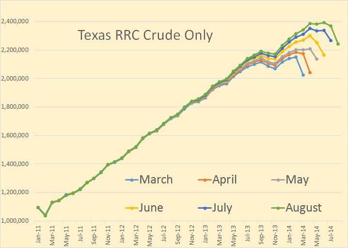
Note that the output chart is for crude only and does not include condensate.
The two charts above are combined (or convolved) to give the output chart below.
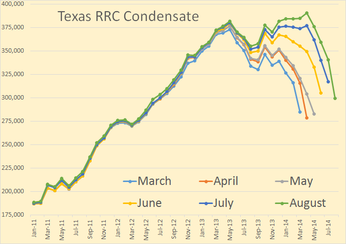
Note that there is about 20% of Eagle Ford output that is condensate, when this condensate is added to the URR above for crude only we get a URR of 5.1 Gb of C+C.
As in the case of the North Dakota Bakken/Three Forks the match between the model and data is surprisingly good considering the simplicity of the model and the complexity of the real world.
Summary
Oil field output can be simulated with the convolution of the average well profile of newly added wells and the number of new wells added each month. I presented several simple models to demonstrate this concept. An obvious weakness for any attempt at forecasting is that the future average well profile may change over time and the number of new wells added in any future month is unknown.
The decline rate of a field of wells will tend to be considerably lower than the decline rate of the individual well. The field decline rate depends on several factors: the decline rate of individual wells, the total number of wells in the field, the period of time over which these older wells were added (whether the period was long or short), and finally the rate at which the number of new wells added decreases as the field begins to decline.
Several models were presented showing how the field decline rate might vary under differing circumstances.
The concepts presented were applied to scenarios which simulated both the North Dakota Bakken and Eagle Ford shale plays with fairly good precision.
In a future post I plan to show how the convolution of two mathematical functions is used to develop the Oil Shock Model.