Open Thread, Any Energy Related Subject

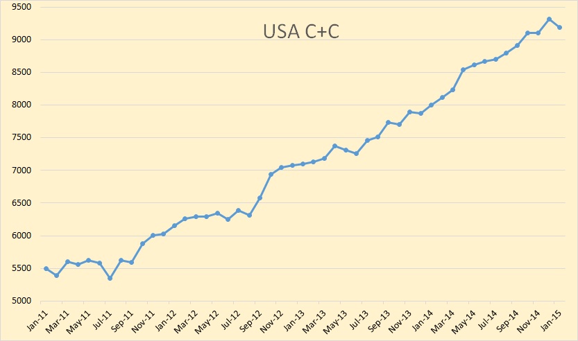
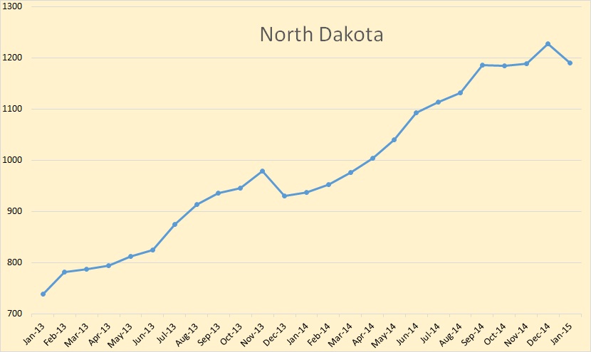
Data for the below chart is from the Weekly Petroleum Status Report.

Daily Price Chart

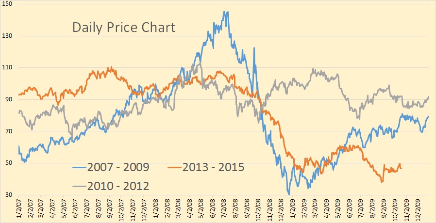
Here we have a three year WTI price comparison chart. You can see that the 2014 price collapse began at almost the exact same time of the year as the 2008 price collapse. The 2008 collapse was a lot more dramatic and fell faster and slightly lower than the 2014 collapse. The 2008 collapse bottomed out around Christmas of that year and the 2014 did not pause until late January 2015. However by late October 2009 the WTI price was already in the $80 range. This time however we are still stuck below $50.

Read More

US January Production Data + Neutral Zone

The latest Petroleum Supply Monthly is out with the USA production numbers for January 2015. The data is thousand barrels per day with the last data point January 2015.

USA C+C

US C+C production was down 135,000 barrels per day in January. That is the biggest monthly decline since July of 2011.

I have shortened the states data to 25 months in order to give more emphasis on the January 2015 data.

North Dakota

North Dakota was down 37,000 barrels per day, exactly what the NDIC reported. That is because the EIA gets their data from the states.

Read More